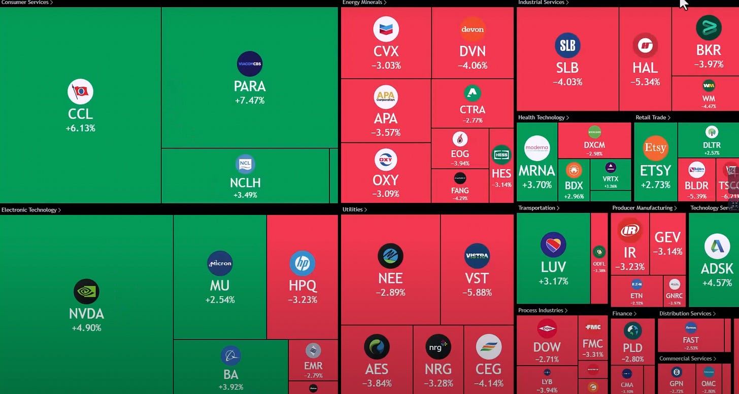
Stock Market Heat Map
A tool I like to use to help me understand how money is flowing in the stock market is the heat map. It tells you which stocks are seeing large buying and which stocks are seeing large sell-offs.
This helps me understand where the market is currently at, and more importantly, where it may be headed.
Let’s look at the heat map for yesterday.
I like to look on the extremes, so this is filtered to stocks >3% and <3%, essentially showing us big movers in both directions.
From this, you can start to see patterns. First, NVDA made a huge move yesterday after announcing a new chip and it looks primed to continue today.
Also, we are seeing money flow into cruise names CCL and NCLH. That is a sector to watch.
On the other hand, we are starting to see energy and oil names sell off. Whereas we were having a lot of buying in these names last week, we saw that cool off yesterday.
So maybe that means that they need to rest before continuing their move.
This is a very quick and easy-to-use tool that I hope is beneficial for you going forward.


